ReThink Green Brand
Category: Branding & Identity
Entered By: Alison Dawson
Date: 2020.10
Description: reThink Green, an environmental programs incubator wanted to elevate their brand and move away from the “grassroots” feel they have had for six years.
The new brand is cleaner and will be much more versatile as the organization changes. All program logos were updated to reflect the new branding, and they plan to only use one logo and one look going forward instead of a new brand for each new program as was done previously.
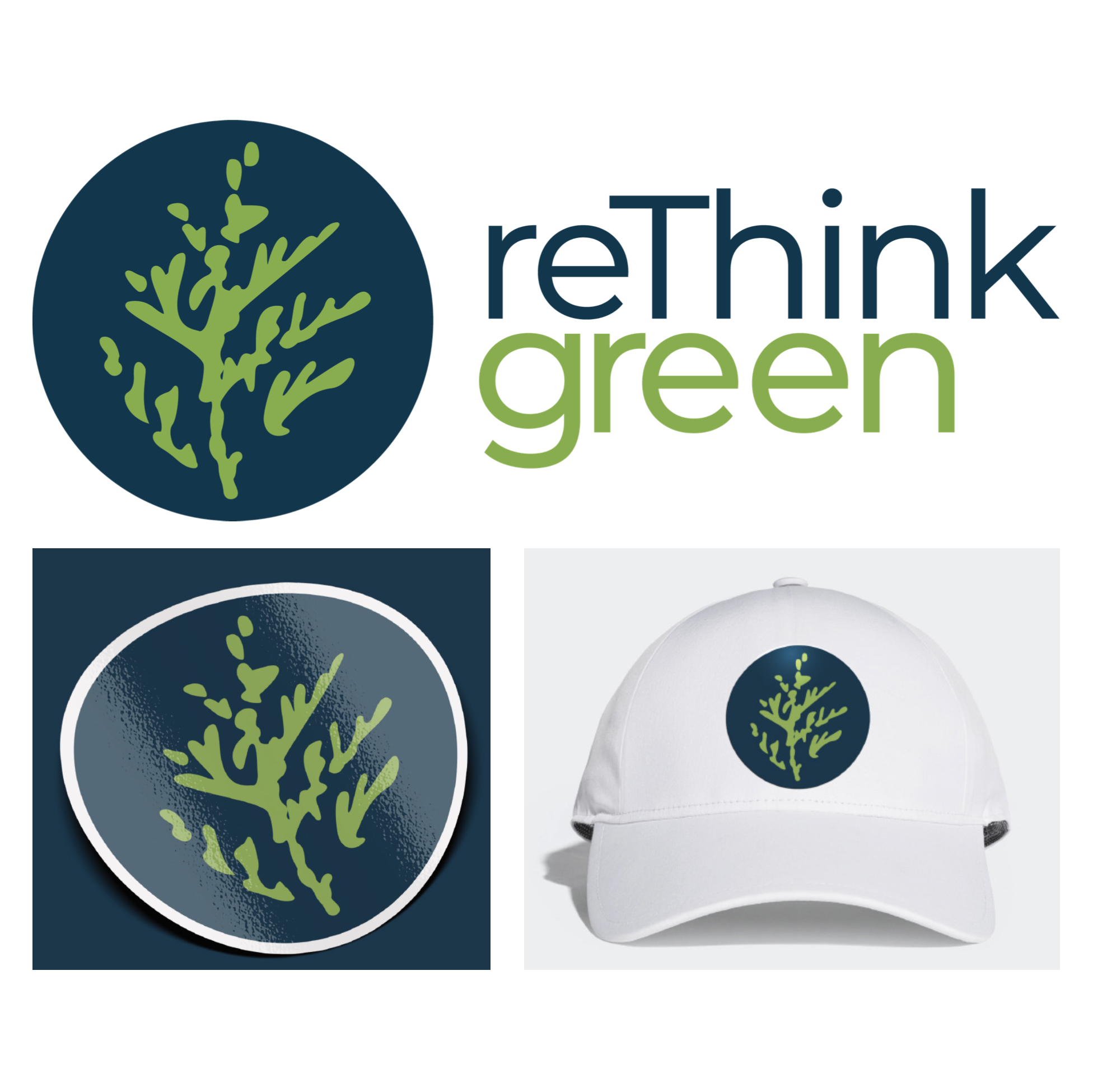
Being an organization that works in and with northern Ontario communities, the logo needed to reflect that. The logomark and logo concept heavily lean into the northern Ontario vibe; known for its lakes, waterfalls, nature paths, and trees.
This logo says they are a part of that community. Both logomark and colours chosen reflect this ideology.
The creation process of this mark also adds a deep connection to the north. A cedar branch was taken from Sudbury, Ontario and dipped into black ink. It was then pressed in a book and the outlines of the ink were loosely traced digitally. This makes the logo completely original and unique.
Credits:
Designed by Alison Dawson
Judge comments
Branding & Identity Judge: Seowon Bang
My selection is reThink Green Rebrand. I am a fan of analogue approaches to branding, starting not from a computer screen but with your hands. I love and appreciate the hands-on process dipping a piece of a local cedar branch and using the digital outline as the logomark. Not only does it make the brand unique (there are no two same branches!), it is literally as well as symbolically rooted in the local communities the organization represents and serves.