From Our Family to Yours- Katarina Perkovic
From Our Family To Yours
Category: Student Category
Entered By: Katarina Perkovic
Date: 2019.11.23
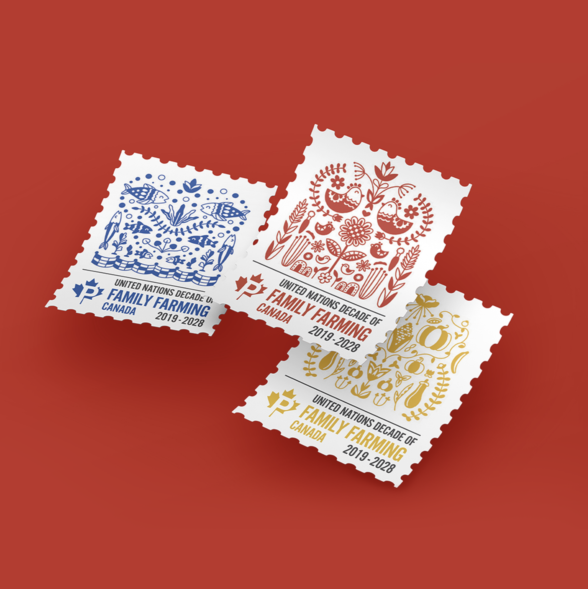
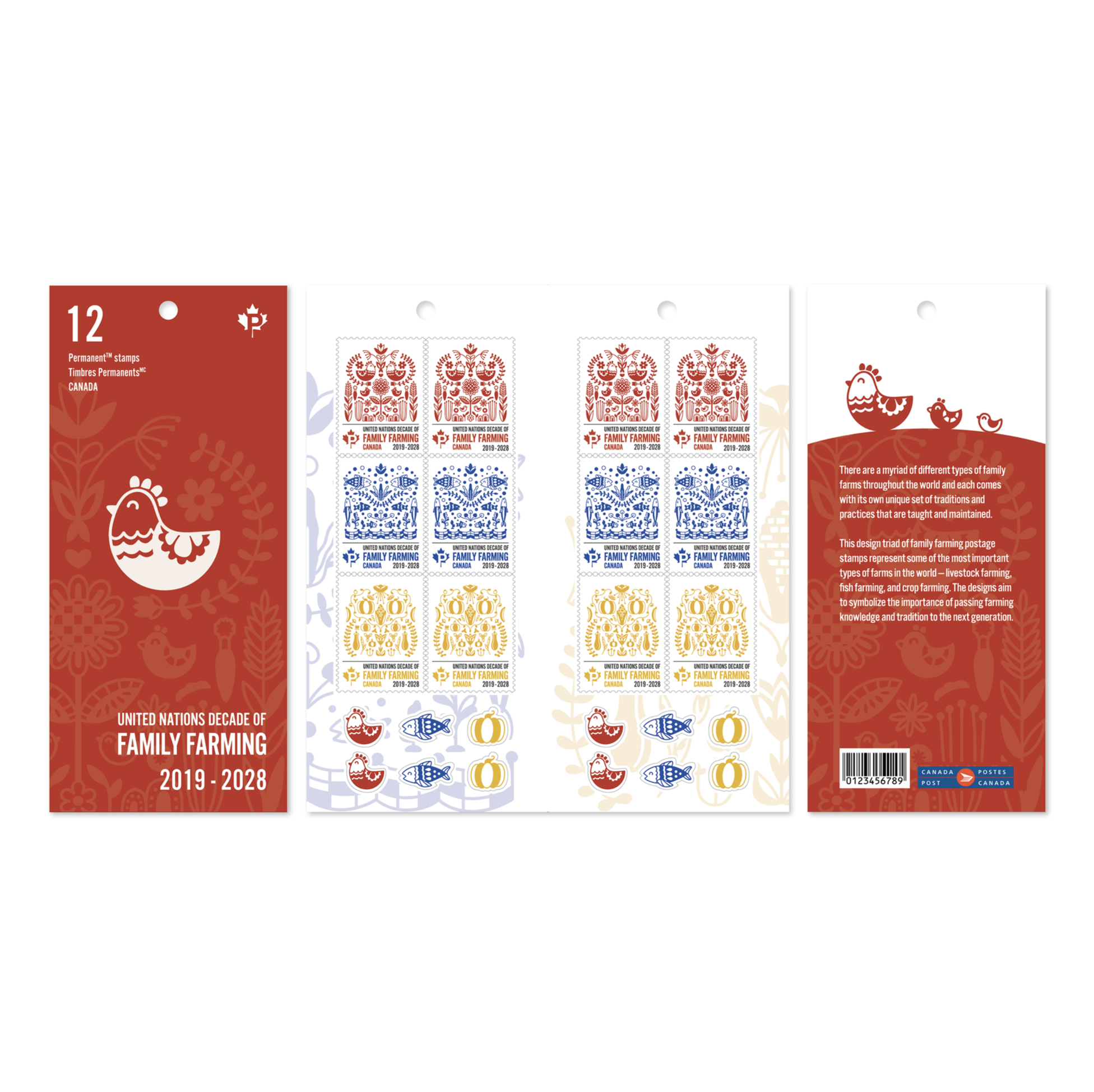
Description: From Our Family to Yours is a postage stamp collection created to commemorate the United Nations Decade of Family Farming.
The stamps represent some of the most far-reaching farming industries in the world — agricultural farming, livestock farming, and fish farming. The designs were created to symbolize the importance of passing farming knowledge and traditions onto the next generation. The idea of family and the passing down of knowledge is present within the families of animals and plants in each stamp design.
The illustration style was inspired by traditional Eastern European folk art, which often uses flat colours and simple visual motifs that are often repeated and mirrored.
Credits:
Project assigned in Advanced Design Applications, taught by Chantal Abdel-Nour
JUDGES COMMENTS
Student Judge: Ron Beltrame
While all of the student award entries displayed creativity and a sound understanding of design principles, I believe the strongest of the projects was the United Nations Decade of Family Farming Campaign. The work is remarkable in that it simultaneously communicates simplicity and complexity...a significant balancing act for a topic that by nature is both local and international. This skillful balancing act is further demonstrated in the execution of the illustrative visuals, which are homespun at first glance but also incredibly sophisticated. The designer also shows a very thorough understanding of concept unity, with all three diverse illustrative concepts sharing enough similarity and balance to be perceived as equal partners. The disciplined decisions to use a simple primary colour palette and clean, legible typography takes this project out of the academic classroom and places it squarely in the professional field. It was a true pleasure to view.