MLA Law - Studio123
MLA LAW
Category: Campaign/Project
Entered By: Studio123
Date: 2018.02.01
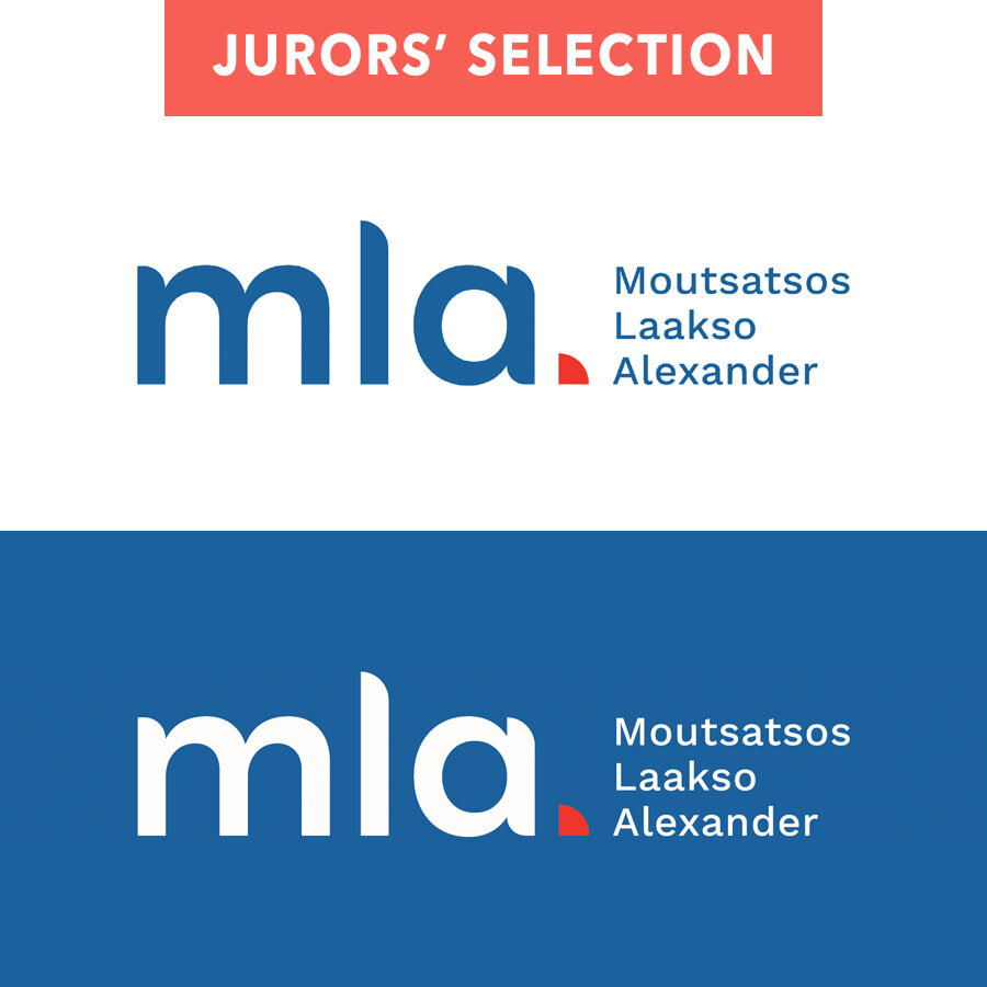
Description: MLA Law is a Northern Ontario-based law firm specializing in business law, real estate law, and wills and estates. Studio123 designed a brand that speaks to their commitment to putting the client first and that visually reflects their modern, progressive approach to law. Studio123 aimed to design a mark that gives the firm a strong, professional and established look to communicate trust and credibility in the eyes of their clients. The red punctuative quadrant, which represents the client being supported by the partnership and its services, is used as a stylized graphic device that is applied across various applications including stationery, printed materials, signage and a slick responsive website. The website, built on WordPress, includes a showcase of the team and its capabilities. Photography was used to introduce the new firm to clients, and to establish a trustworthy and approachable tone. Each of MLA Law’s core services are paired with key team members who manage those departments. This feature is easily edited by a website administrator using the site’s intuitive content management system.
La Description: MLA Law est un cabinet d’avocats basé dans le nord de l’Ontario et qui spécialise dans le droit des affaires, le droit immobilier et les testaments et successions. Studio123 a conçu une marque qui témoigne de son engagement à donner la priorité au client et reflète visuellement leur approche moderne et progressive du droit. Studio123 visait à concevoir une marque qui donne à la firme une apparence forte, professionnelle et bien établie pour communiquer de la confiance et crédibilité aux yeux de leurs clients. Le quadrant rouge, qui représente le client qui est soutenu par le partenariat et ses services, est utilisé comme un dispositif graphique stylisé appliqué à diverses applications, notamment la papèterie, les documents imprimés, les panneux affiches et un site Web très réactif. Le site Web, construit sur WordPress, comprend une vitrine de l’équipe et de ses capacités. La photographie a été utilisée pour présenter le nouveau cabinet aux clients et pour établir un ton digne de confiance et accessible. Chacun des services principaux de MLA Law est associé à des membres clés de l’équipe qui gèrent ses départements. Cette fonctionnalité peut être facilement modifiée par un administrateur de site Web à l’aide du système de gestion de contenu intuitif du site.
Jurors Selection
“The law firm branding was a fresh take on law firm branding that successfully differentiated this company from others in the market. It goes against the traditional, stuffy, conservative look with a modern, fun approach that would appeal to a new generation of people who need to seek law services. I especially like the way the logotype was customized to help better relate to the demographic it’s seeking to attract.”
- ATHENA HERRMANN